
Project Overview
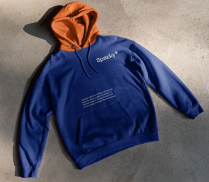
ROMA produced a set of Sparky* branded merchandise using a mug and tote bag. The work focused on consistent logo use, clear typography, and high-contrast layouts that carry the Sparky* identity into everyday items.


Our Solution
Using Sparky*’s existing visual language, ROMA defined a straightforward merchandise layout system. Logo placement, spacing, and type treatment were set up to work across products and formats. The mug and tote were designed for regular use and for visibility in photos, events, and internal materials.
The Result
The merchandise set applies the Sparky* identity consistently across physical items, with clear typography, high-contrast color choices, and controlled logo placement. The mug and tote follow the same layout rules, which keeps the brand presentation uniform across different materials and mockup contexts.
Each item was designed to work in everyday use while remaining readable at a distance and in photography. Spacing and alignment were refined to keep the mark legible on curved surfaces and fabric folds, and to avoid distortion in typical product angles. This makes the assets reliable for website visuals, internal decks, event materials, and social posts.
With a simple system in place, the merchandise can be extended to additional items (apparel, packaging inserts, stickers, or event materials) without changing the core structure. The result is a small set of practical products that also strengthens recognition through repeated, consistent exposure in daily and public-facing settings.